My Dr. Headache Roll-On
Packaging design for an OTC healthcare product that was later featured on a Times Square billboard.
category
Packaging Design / Healthcare Product
Role
Graphic Designer (Packaging)
type
Print & Digital
Deliverable
Product Packaging Design, Label Design

The MyDr. Headache Roll-On is a compact, fast-acting healthcare product designed to provide quick relief from headaches, migraines, and stress using a blend of natural oils.
The objective was to design packaging that communicates instant relief, ease of use, and trust, while standing out in a highly competitive OTC healthcare market.
The product later gained large-scale visibility by being featured on a Times Square digital billboard in New York, amplifying the importance of clear and impactful packaging design.
Designing for Instant Recognition & Trust
Creating packaging that communicates relief, clarity, and credibility at a glance.
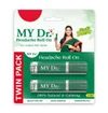
The approach focused on simplifying communication for a fast-moving consumer product. Since users often make quick decisions in healthcare categories, the design emphasized clear hierarchy and immediate readability.
Key product benefits like quick relief, non-greasy application, and portability were visually structured to be understood instantly.
The visual language balanced medical credibility with accessibility, avoiding overly clinical aesthetics while still maintaining trust.
Special attention was given to how the packaging would scale from small retail shelves to large-format displays, ensuring it remains impactful across contexts.

From Shelf to Times Square
The final packaging successfully translated the product’s purpose into a clean and effective visual format.
Its clarity and visual strength allowed it to scale beyond retail, eventually being featured on a Times Square billboard, demonstrating how strong packaging design can extend into large-scale brand communication.
The design contributed to a more professional and recognizable presence for the product across both physical and digital platforms

Designing for Scale & Visibility
This project highlighted how packaging is not just about shelf appeal, but about communication at every scale.
Designing for a product that later appeared in a global advertising space reinforced the importance of clarity, hierarchy, and adaptability.
It also strengthened my understanding of how even a single design touchpoint, like packaging, can play a role in broader brand visibility and perception.